Bank Jago App Redesign Concept
UI/UX redesign concept for Jago digital banking app focusing on clarity, budgeting, and modern visual identity.


Overview
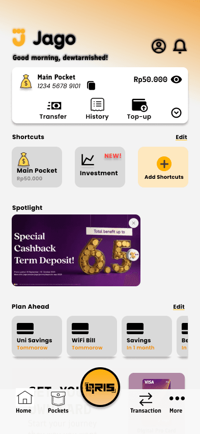
This project is a personal UI/UX redesign concept of the Jago digital banking mobile application. The goal is to improve usability, visual consistency, and financial clarity for users through a cleaner layout, better information hierarchy, and a modern fintech aesthetic. The redesign covers key flows such as login, home dashboard, pockets/assets, transactions, cards, and analytics.
My Role
UI/UX Designer
Team Size
Solo
Tech Stack
Problem
Existing digital banking apps often feel cluttered, overwhelming, and confusing for users when managing multiple pockets, cards, and financial data. Important information like balances, assets distribution, and upcoming transactions are not always easy to understand at a glance.
Solution
This redesign introduces a clear visual hierarchy, modular card-based layout, consistent color system, and simplified navigation. Financial information is presented using charts, grouped pockets, and focused CTAs to help users quickly understand and manage their money.
Key Features
- 1Redesigned home dashboard with clear balance overview
- 2Pocket-based asset management with visual grouping
- 3Transaction and payment shortcuts optimized for one-hand use
- 4Modern PIN entry and authentication screen
- 5Asset analytics with donut chart visualization
- 6Card management UI with clean visual hierarchy
Challenges & Learnings
Challenges: Balancing visual aesthetics with financial clarity and ensuring complex banking features remain simple and intuitive without overwhelming the user.
Learnings: Improved understanding of fintech UX patterns, information hierarchy for financial data, and designing scalable design systems for mobile apps.
Result
A complete high-fidelity mobile banking UI concept that demonstrates strong fintech UX understanding and can be used as a portfolio showcase for UI/UX and product design roles.